Hey all, before I show an example of an informative workspace, first another quote from the book, The Art of Agile Development
An informative workspace broadcasts information into the room. When people take a break, they will sometimes wander over and stare at the information surrounding them. Sometimes, that brief zoneout will result in an aha moment of discovery.
An informative workspace also allows people to sense the state of the project just by walking into the room. It conveys status information without interrupting team members and helps improve stakeholder trust
Right. So, here’s an example of such a workplace:
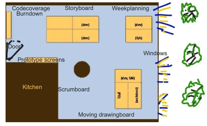
Let us quickly go around this room. Suppose you were working here? You will like the windows! being able to immediately look outside to let the creative mind wander is an asset not every developer is given. Embrace that as long as it lasts!
Of course the scrum board and story board look to be placed wrong as the Product Owner (PO) might need to be close to the story board while the Devs should be closer to the scrumboard. But this apparent mismatch actually is a good thing: people will move around the room and notice discussions at boards outside of their designated roles. This is important to prevent silo’s from (re)ocurring.
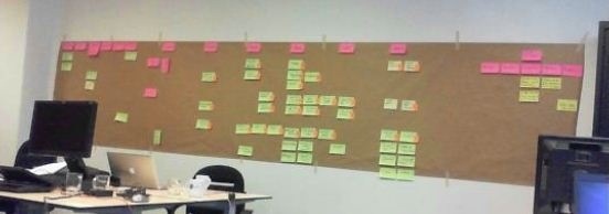
If we enter the room via the door, we see the information radiate at us from all walls immediately. To the left we can see the long wall that has the story board for all upcoming sprints:
The story board contains all the user stories we could think of to complete the product. Sized by the team in t-shirt sizes (small, medium, large) to give the global overview.
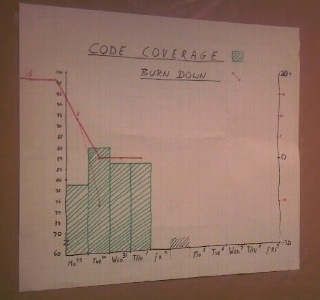
To the immediate left of the door when entering we see a graph that shows the burndown chart plus something we really emphasize these days: our code coverage. It is reaching 80%, a pretty good figure.
If you have designs, maybe made or drawn by a business analyst or graphic designer don’t let it rot in an electronic document stored in an unknown place of your company wiki, but print it all out and be sure to display it:
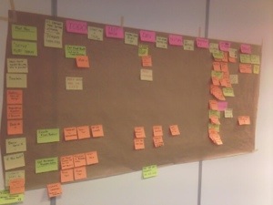
Of course we also have our planning board or taskboard Aka…
We definately need a drawing board too:
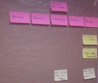
Lastbut not least, we always update our weekly events on our weekboard. Crucial because it shows what team members might not be in during the week, for whatever reason, or raises attention to important upcoming events like trainings, the sprint review and retrospective or planned team events.
In short: the informative workspace shows all team members what is being worked on, raises important focus points for the team and helps the team to collaborate to achieve.
Questions? Let me know how your team configured your teamroom!
At time if writing: Melle is in the role if Scrum Master at Travix International in the Netherlands. He is a proficient team lead and has more than fifteen years experience in the industry in different roles from software engineer, unit manager, test coordinator, team lead, coach of software engineers, to scrum master. If you want to know more, get in touch.


Comments
One response to “The informative workspace”
Hey, that looks familiar;-)
But it is quite true. An informative (and nice) workspace boosts morale, productivity and stakeholder trust.
Like!